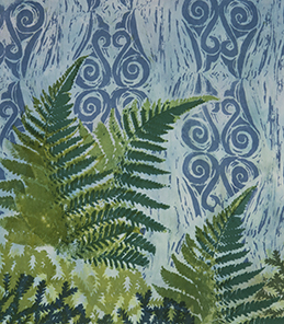
One of the best aspects of being a surface designer is the ability to create tools for printing that hold personal meaning. In this article I outline how I have developed a variety of tools inspired by an epic family trip to New Zealand. All the techniques and processes used in this article are included in the new book I co-authored with Melanie Testa, Playful Fabric Printing. You can see more process photos on my blog: www.carolsoderlund.com/blog.
During our trip we enjoyed hiking on both islands—so different, yet each characterized by abundant greenery. I especially loved the abundant ferns—small and large, smooth and rippled, green and even red ones. Do you recall the legend of the red fern? Planted by angels, the red fern will never die.
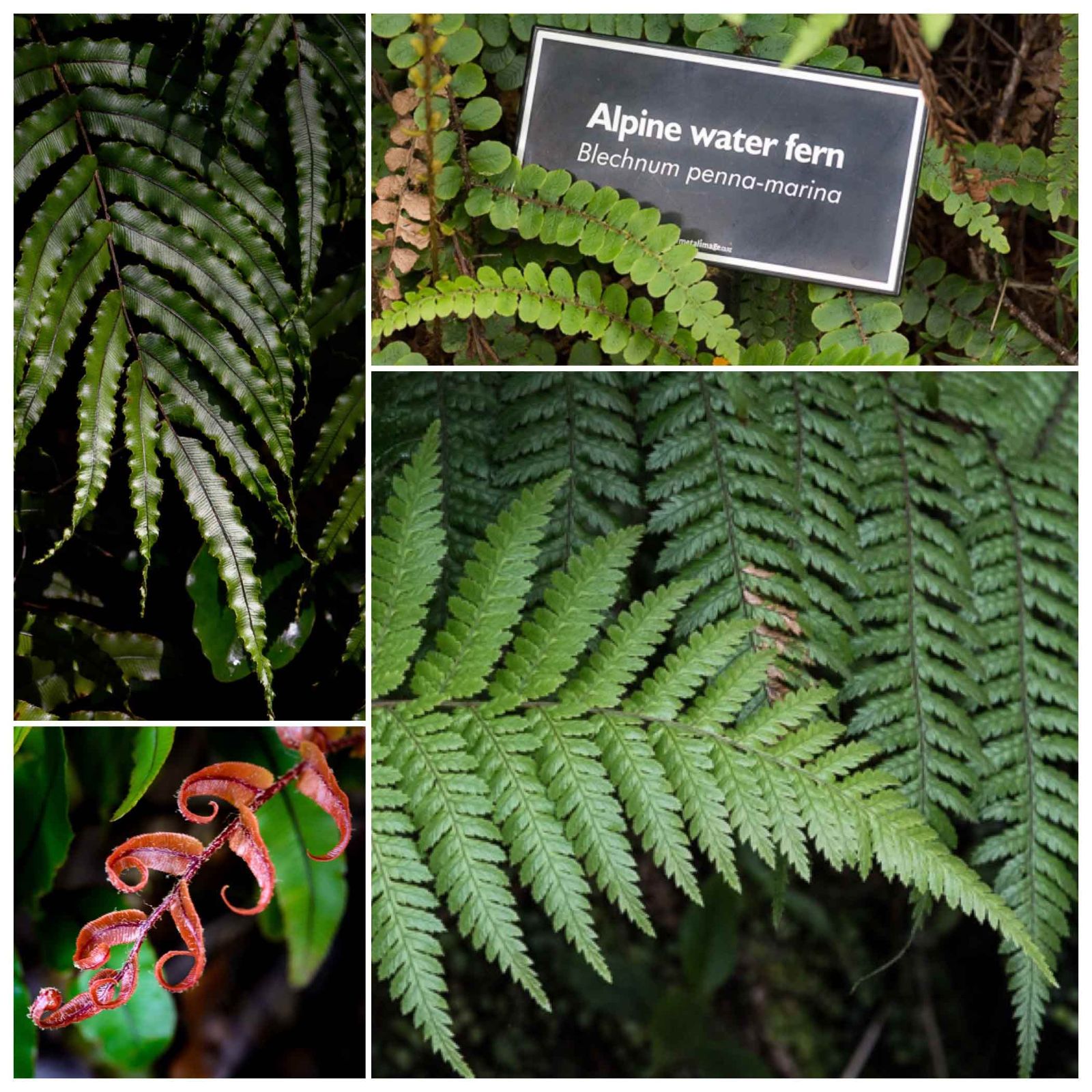
New Zealand ferns
Upon returning from the trip, I set out to do some print work using the theme of ferns, prompted by my New Zealand trip but inspired by my lifelong ferny love.
Monoprints may be my favorite starting point with a natural subject. Many surfaces can be used for monoprints, including glass, vinyl, a sheet of fun foam attached to a plexi plate, even Ikea placemats— but I chose my favorite—the Gelli Arts® plate.
Though fabric paint is used most often with Gelli Arts® plates, Melanie and I have discovered a way to use thickened Procion MX dyes with them, with no discoloration or harm to the plates themselves.
Let the playful printing commence!
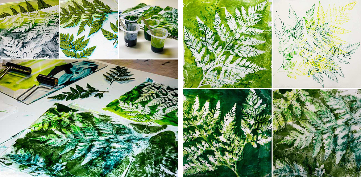
Gelli® plate monoprints in progress and the finished prints
With monoprints as warm-ups, I envisioned more tools I want to make around this theme. While traveling, photography is my primary way of recording what attracts me about a culture and a place. Many of the tools I made are based on my photographs of ferns. When studying a photo, I have a number of options: I could make a sketch from the photo, do a tracing, or alter the photo in Photoshop or another image editor. I could keep it quite detailed or abstract it. I also need to consider the scale I want the image to be when printing.
Some images lend themselves easily to interpretation – for example, the red fern image above. I love the shape of it, the spiraling petals, and the strong stem, in contrast to so many delicate ferns.
I could isolate the main shape and increase the contrast in the image and then use it to make a Thermofax screen. Or, I could make a foam stamp from the image by abstracting it in a drawing and then using the drawing to create the stamp.
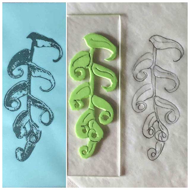
Thermofax screen and foam stamp of the red fern
Here are test prints from these tools. The left side is the Thermofax print. The center is the foam stamp print. The right shows layering the Thermofax on top of the foam stamp for another look.
Each of these paths lead to a certain effect, or look, when printing. They are all good, so how do I choose? Often, the choice may depend on the look I want. Sometimes I will choose based on the materials I have on hand. Sometimes I will choose based on time factors; for example, foam stamps are very quick and fast. Thermofax screens can take longer, because of the graphic work required (but I enjoy that part!). Other times I just feel in the mood to carve.
I also developed several Thermofax screens for the silver fern and an unknown lacy fern. In testing out these screens, I used a base cloth that had previously served as a demo cloth. Nothing is ever wasted!
When printing in this freeform manner I often go back and forth between printing and making tools as ideas occur. It is a fun way to work!
Having numerous fern images, I decided I wanted a companion image that would complement the ferns, but add some abstraction to the developing fabric prints.
Ferns abound in New Zealand, but they are more than just a natural presence there—they are a cultural presence too. The symbol of the silver fern, in its many forms and variations is very much in evidence everywhere you look in New Zealand, from the airplane you arrive on, to the dinnerware you eat from, on every piece of signage and every brochure, on mugs and jewelry, caps and tees.

The koru depicted on a New Zealand Air plane
For the indigenous New Zealanders, the Maori, the silver fern was an important symbol used in jewelry and in carvings decorating their meetinghouses. Called the Koru, (the Maori word for “loop“) the spiral shape is reminiscent of an unfurling frond. It symbolizes new life, growth, strength and peace.
The koru’s circular shape helps to convey the idea of perpetual movement while the inner coil suggests a return to the point of origin. Art depicting the Koru is seen everywhere. One piece I really enjoyed was a fired clay mural in the town of Coromandel.
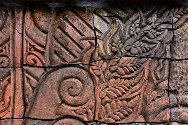
The koru as part of a mural in Coromadel
Including the Koru in my printmaking seemed a wonderful way to mark this journey. I honed in on a design of loops and spirals and hooks, as in a lot of the jewelry I had seen. What type of tool would suit the design? A stencil was an obvious answer, but that would lead to very clean lines. I chose to interpret the design in a carved block, reminiscent of the Maori carvings I saw in the museum in Christchurch. I kept the carving deliberately rough, to hint at wood grain.
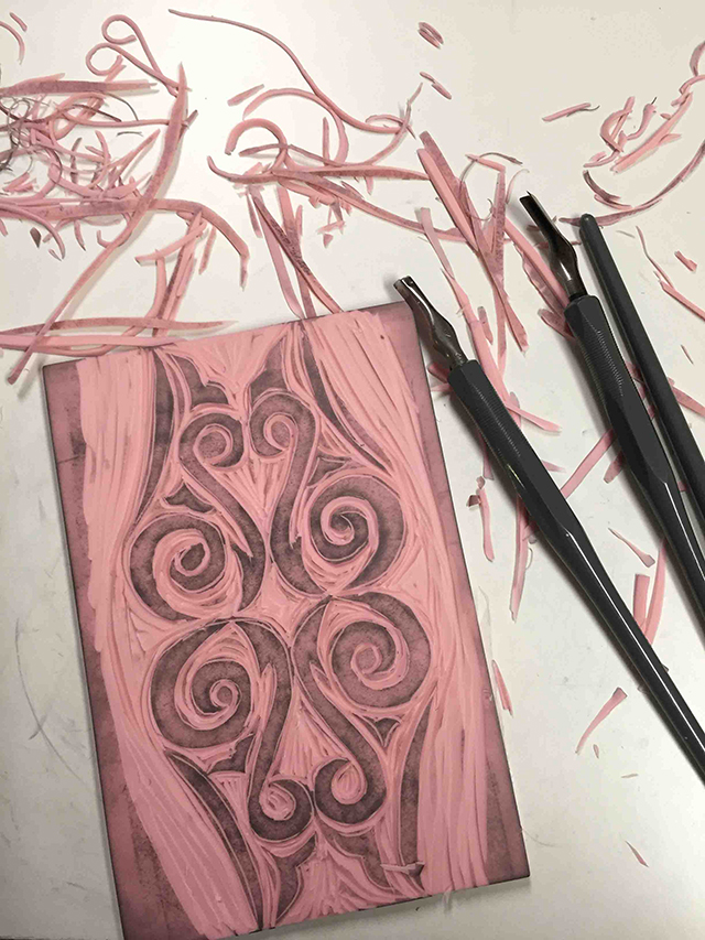
My koru-inspired carved stamp
The next step was to incorporate it onto several pieces in progress. On this small piece it became a background element. This measures about 11” x 12” before quilting. I am looking forward to seeing what quilting adds!
ABOUT THE ARTIST
 An artist and educator for 25 years, Carol is known for her Color Mixing system for Procion dyes. A former highschool teacher, she was nominated for Teacher of the Year in 2013 and again in 2015 by the International Association of Creative Arts Professionals. Carol is co-author of Playful Fabric Printing with Melanie Testa.
Read more about her adventures on her website: http://www.carolsoderlund.com/
Other Links:
http://www.facebook.com/CarolSoderlund
http://www.instagram/carol_sode
https://www.pinterest.com/csoderlund/


